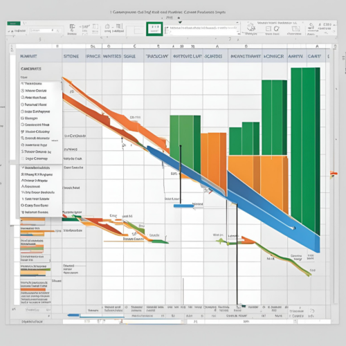
In the realm of project management, the ability to visualize timelines and project schedules is paramount. One of the most effective tools for achieving this visualization is the Gantt chart. Originating from the early 20th century, Gantt charts have become a staple in project management due to their simplicity and effectiveness. For many professionals, Microsoft Excel serves as the primary software for creating Gantt charts due to its widespread availability and versatility. This blog post aims to provide a detailed guide on how to create a Gantt chart in Excel, which can prove invaluable for project managers, team leaders, and anyone involved in coordinating tasks and timelines.
Understanding the Gantt Chart
Before delving into the technicalities of creating a Gantt chart, it is essential to understand its components and benefits. A Gantt chart is essentially a horizontal bar chart that represents a project schedule over time. The primary elements of a Gantt chart include:
- Tasks or Activities: Each row in the chart usually represents a specific task or activity within the project.
- Time Intervals: The chart typically spans across days, weeks, or months, depending on the project timeline. Time intervals are usually represented along the horizontal axis.
- Bars: Horizontal bars illustrate the duration of each task, indicating when the task begins and ends. The length of the bar correlates with the time required to complete the task.
- Dependencies: Some Gantt charts include the relationships between tasks, showing how one task may depend on the completion of another.
The utility of Gantt charts lies in their ability to provide a snapshot of the project’s status, helping stakeholders identify overlaps, delays, and progress at a glance.
Preparing Your Data
Creating a Gantt chart in Excel begins with meticulous data preparation. Follow these steps to organize your information:
- List Tasks: Open a new Excel workbook and create columns titled “Task,” “Start Date,” “End Date,” and “Duration.” Input your project tasks in the “Task” column.
- Set Dates: In the “Start Date” column, input the respective start dates for each task. In the “End Date” column, specify when each task is expected to be completed.
- Calculate Duration: In the “Duration” column, calculate the time each task will take. This can be done by subtracting the start date from the end date using the formula:
=End_Date - Start_DateFormat the cells in the “Duration” column as general numbers.
For example, if a task starts on January 1, 2024, and ends on January 10, 2024, the duration will be 9 days.
Creating the Gantt Chart in Excel
With your data properly organized, you can now create the Gantt chart:
- Select Your Data: Highlight the relevant columns containing the task names and the start dates, avoiding the column headings.
- Insert a Stacked Bar Chart: Navigate to the Ribbon, click on the “Insert” tab, and select “Bar Chart.” From the drop-down menu, choose “Stacked Bar.”
- Adjust Data Series: Right-click on the chart area and select “Select Data.” In the “Legend Entries (Series)” section, add two data series:
- For the first series, use the “Start Date” data. This will create a baseline for the timing of each task but will initially appear invisible because of its starting point on the X-axis.
- For the second series, add the “Duration” data. This will visually represent the length of each task.
- Format the Chart: The chart will initially display tasks in reverse order. To correct this, select the Y-axis (the task list), right-click, and choose “Format Axis.” In the Axis Options, check the box for “Categories in reverse order.”
- Hide Start Dates: To make the Gantt chart visually appealing, format the bars representing the start dates to be transparent. Click on the series representing the “Start Date,” select “Format Data Series,” and set the fill to “No fill.”
- Customize Your Chart: Modify your chart as necessary to improve readability. You can add:
- Data Labels: Show task names or durations on the bars.
- Title: Give your chart a descriptive title.
- Color Coding: Use different colors for different categories of tasks or to signify their status (e.g., completed vs. ongoing).
Enhancing Your Gantt Chart
To further augment the utility and visual appeal of your Gantt chart, consider incorporating the following features:
- Milestones: Designate key project milestones using a marker such as a diamond shape or a different color bar.
- Task Progress: To indicate completion, you can create an additional series for “Progress” that will illustrate how much of the task has been completed.
- Dependencies: If your project involves dependencies, consider using lines to connect related tasks. Although Excel does not offer this feature natively in Gantt charts, you can draw lines manually using the “Shapes” tool.
Conclusion
Creating a Gantt chart in Excel is a practical and efficient method for project management professionals seeking to visualize their project timelines. By following the steps outlined in this post, you can develop a Gantt chart that not only captures project information effectively but also enhances clarity and communication amongst team members. While Excel may not have the advanced project management functionalities of specialized software, its accessibility makes it an excellent option for creating simple yet informative Gantt charts.
As you become more adept at using Excel for project management, consider exploring additional features such as conditional formatting and pivot tables to further enhance your charts and project planning capabilities. Ultimately, the key to a successful project lies in clarity of communication, and a well-constructed Gantt chart serves as a crucial tool in achieving that objective.
